From the Brand Persona document: “The wise Harbor Pilot navigates you through change and leads you safely to your destination … His wisdom is accumulated from a lifetime of experiences on the water and at the helm. Between managing supporting vessels and directing onboard crew, the Harbor Pilot carefully plots your course and guides you through safe passageways. He is everything you look for from a trusted team player … The Harbor Pilot is a virtuoso of navigation. … He understands the complexities, perils and opportunities of each path because he’s traveled them countless times. Though there may be many routes, there is only one that is best for you, and whether it serves his interests or not, he’ll set you on that path. His answers aren’t always easy, but they inevitably guide you smartly to where you need to go.”
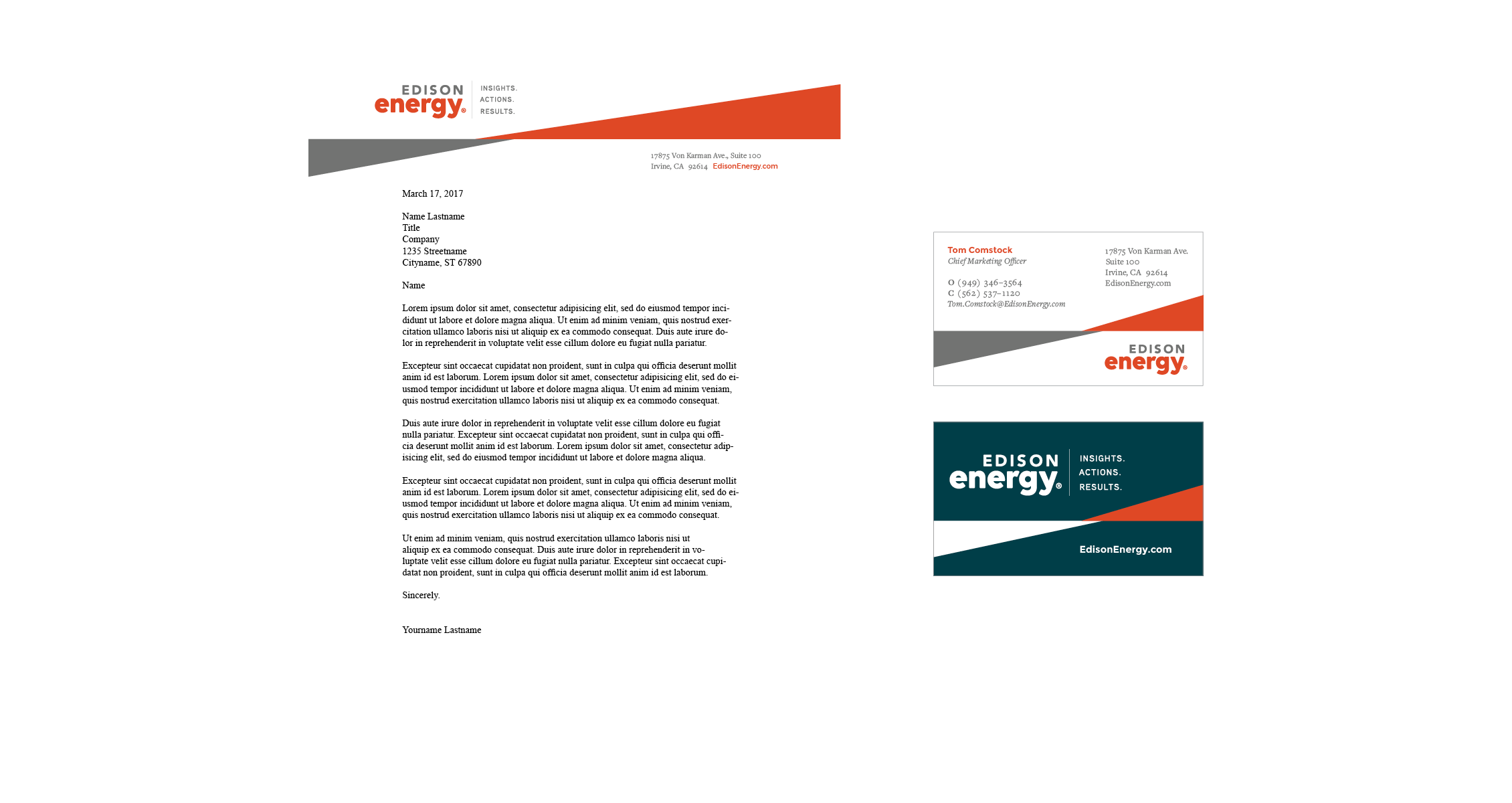
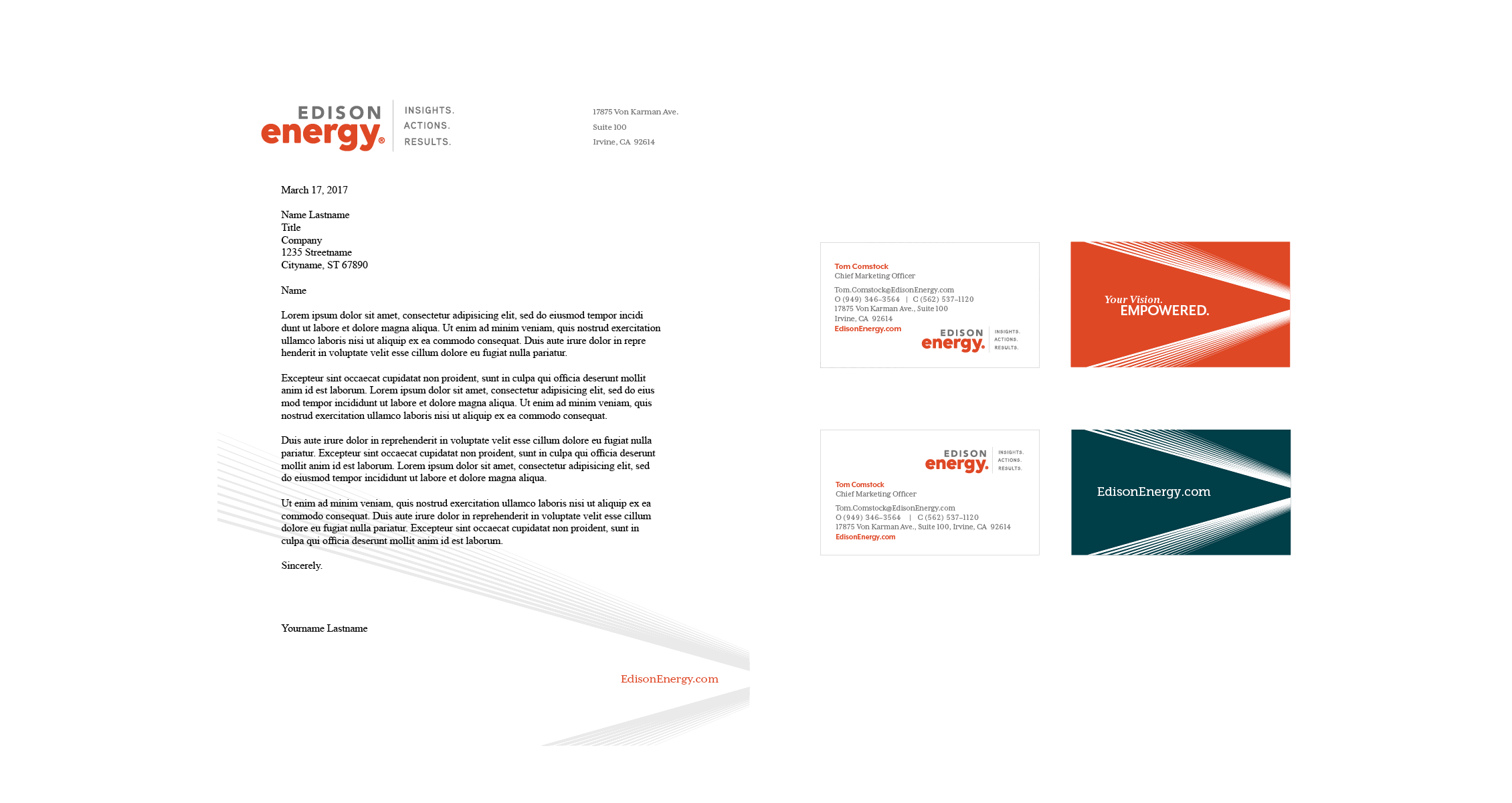
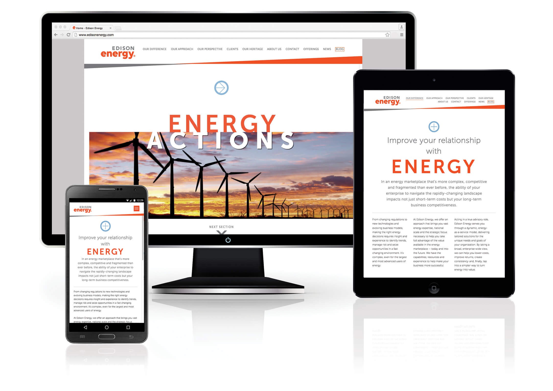
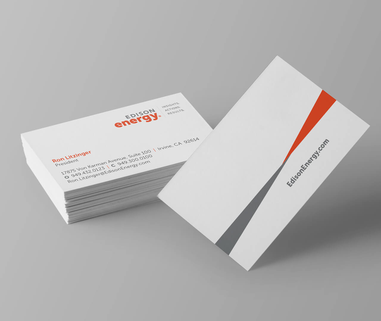
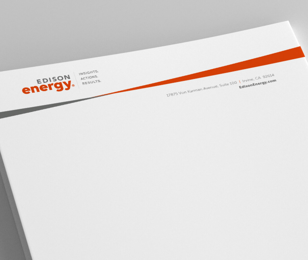
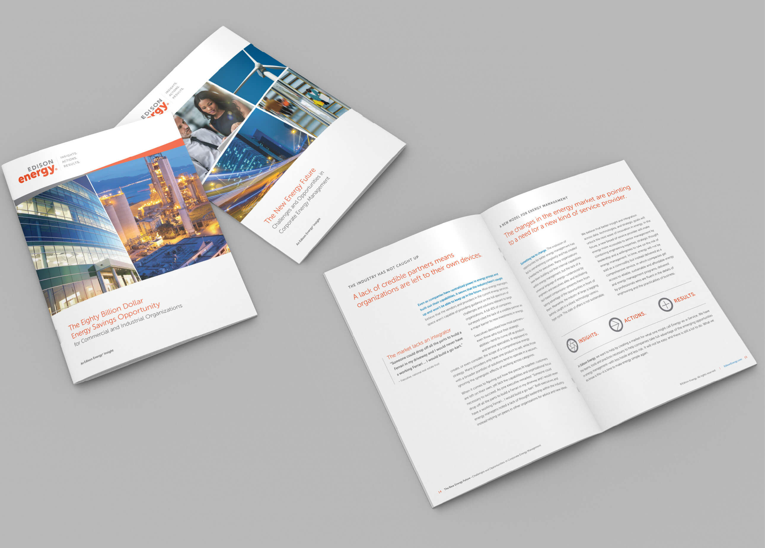
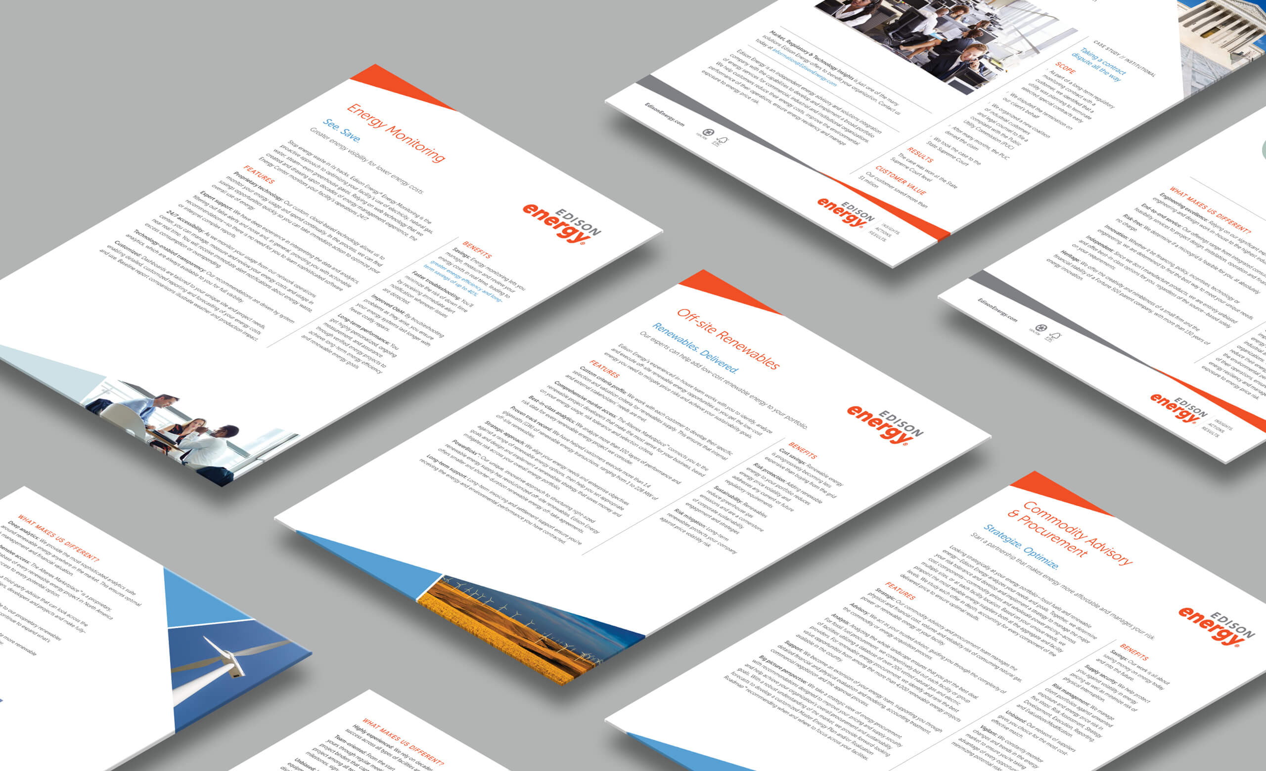
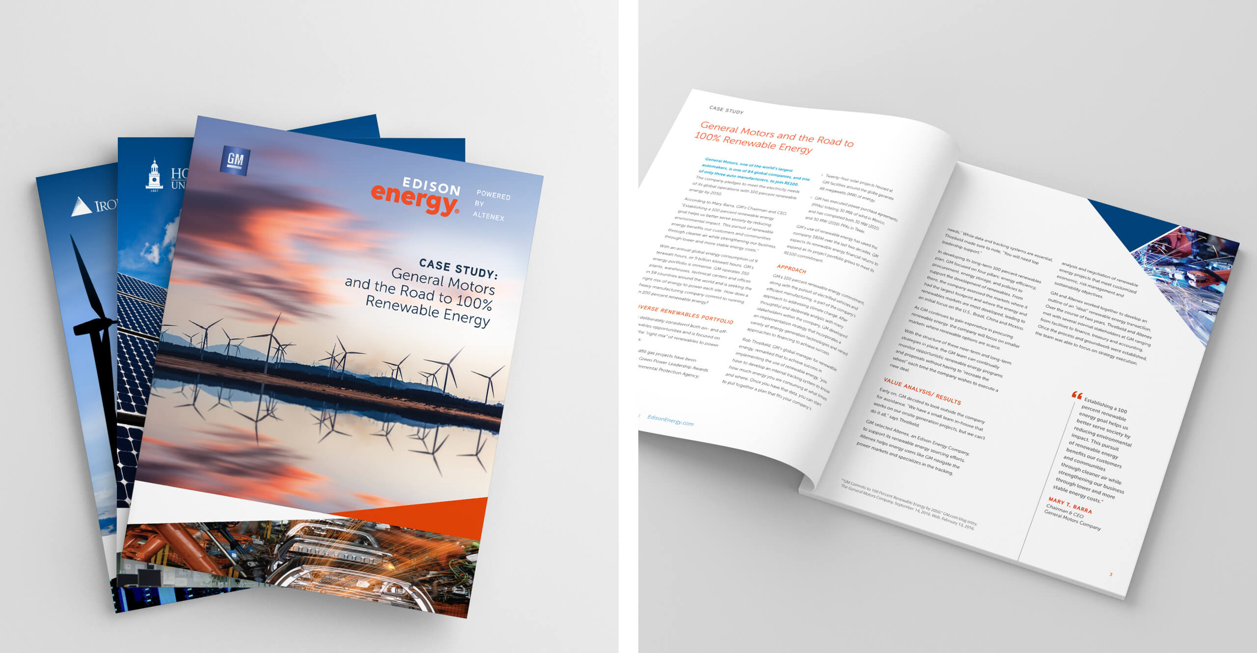
Inspired by this, the chosen visual identity concept features two main graphic elements:
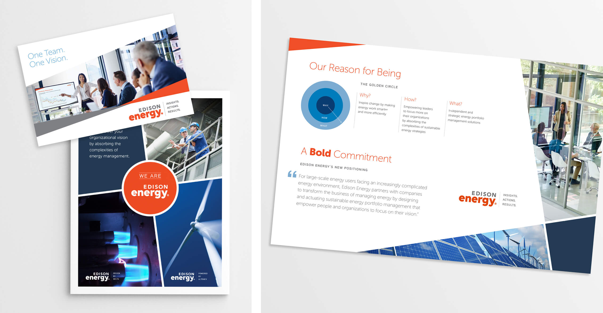
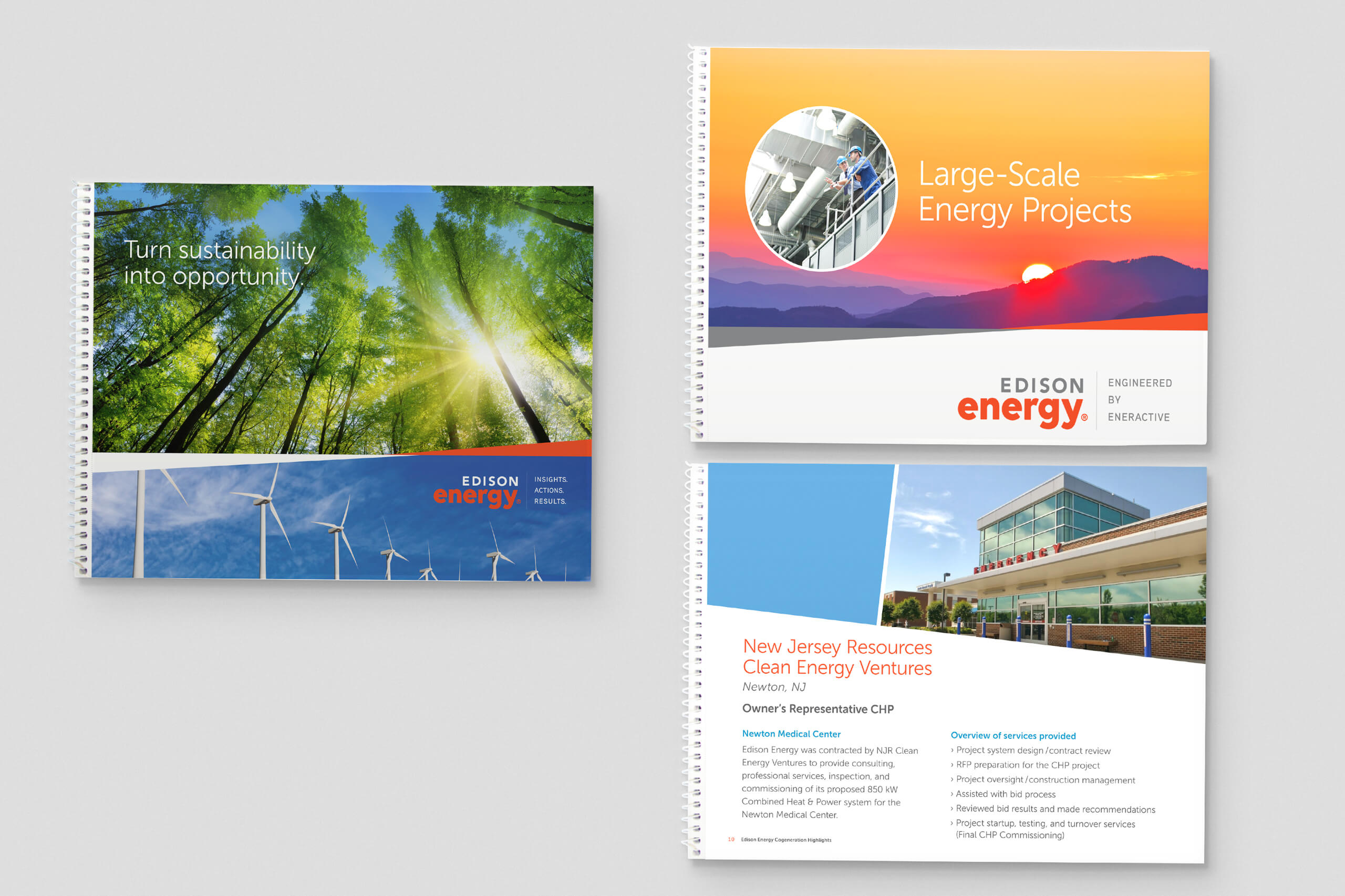
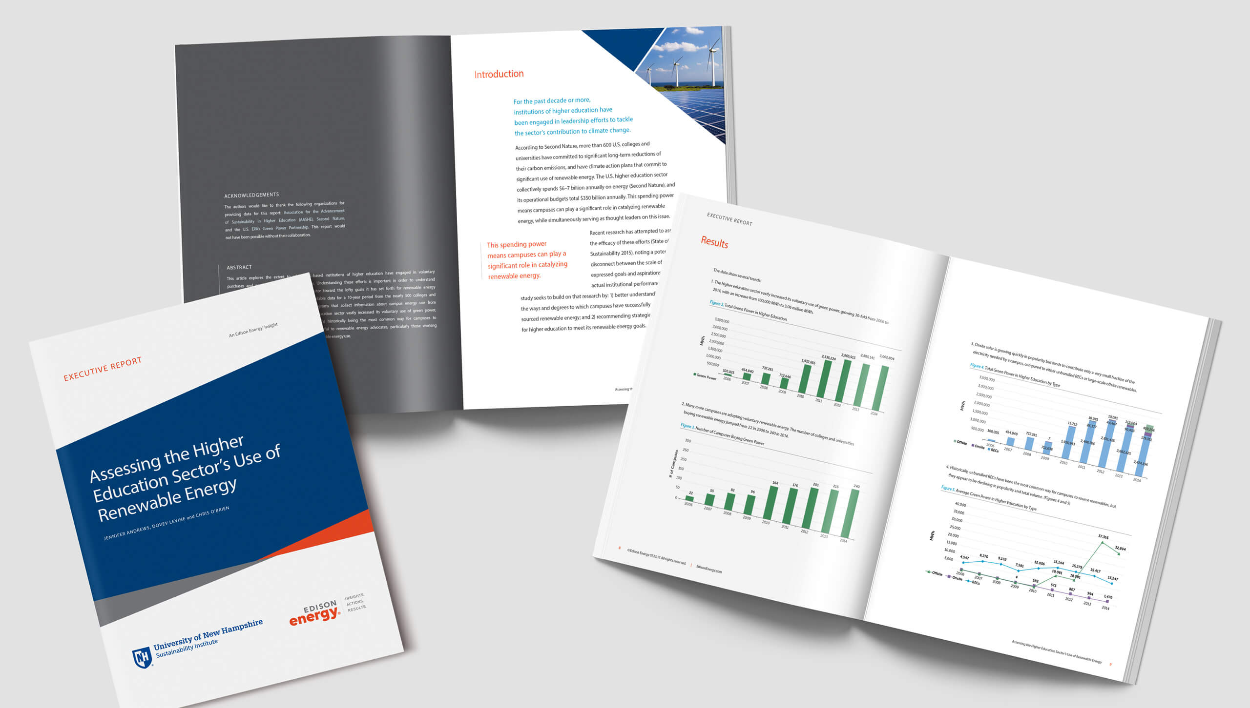
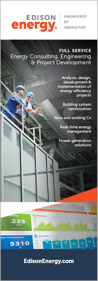
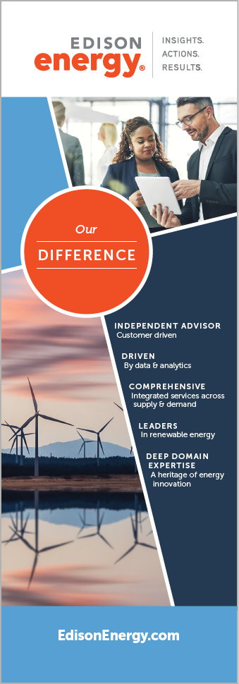
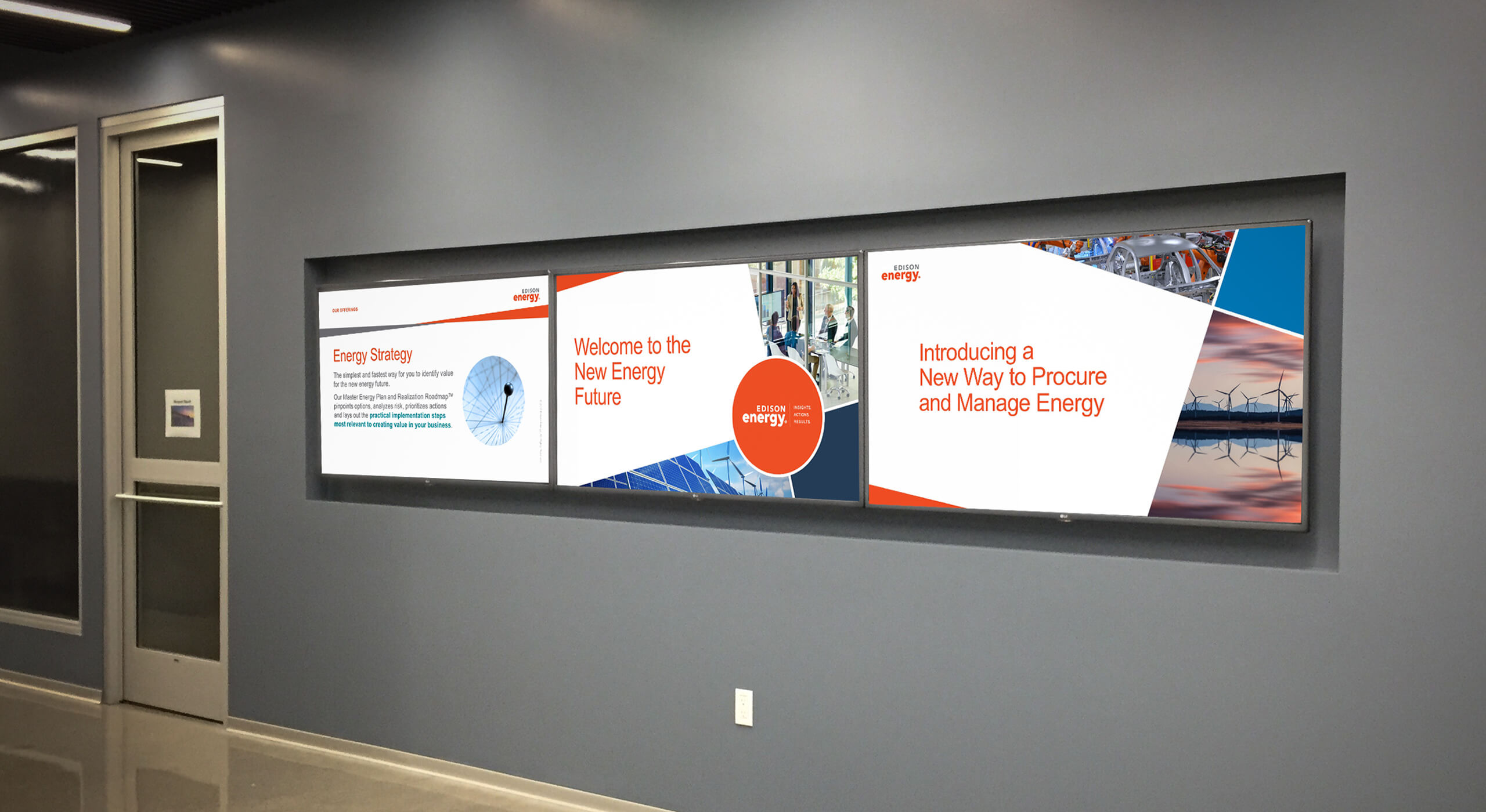
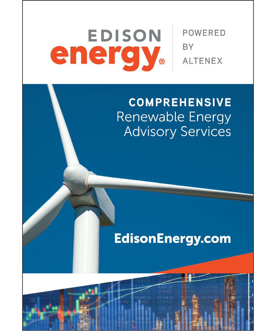
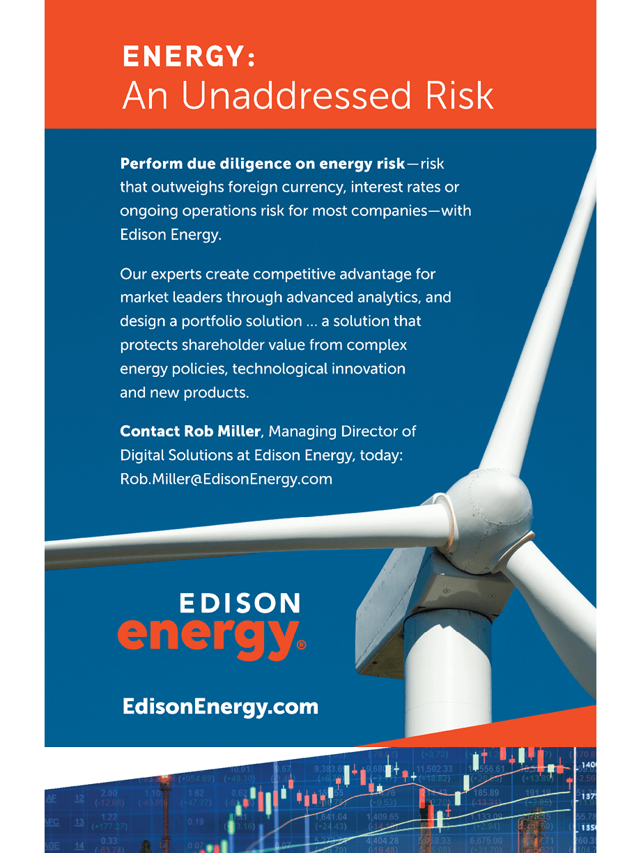
The horizon line graphic represents Edison Energy and its clients, working together in synergy. The triangles suggest a horizon line of a calm sea. The orange triangle represents Edison Energy in a guiding/ leadership position, plotting the course and guiding clients through safe passageways — leading them safely to their destination. The triangle shapes change in size, depending on the situation in which they are used — much like Edison’s solutions to client challenges — but the horizon line is always constant.
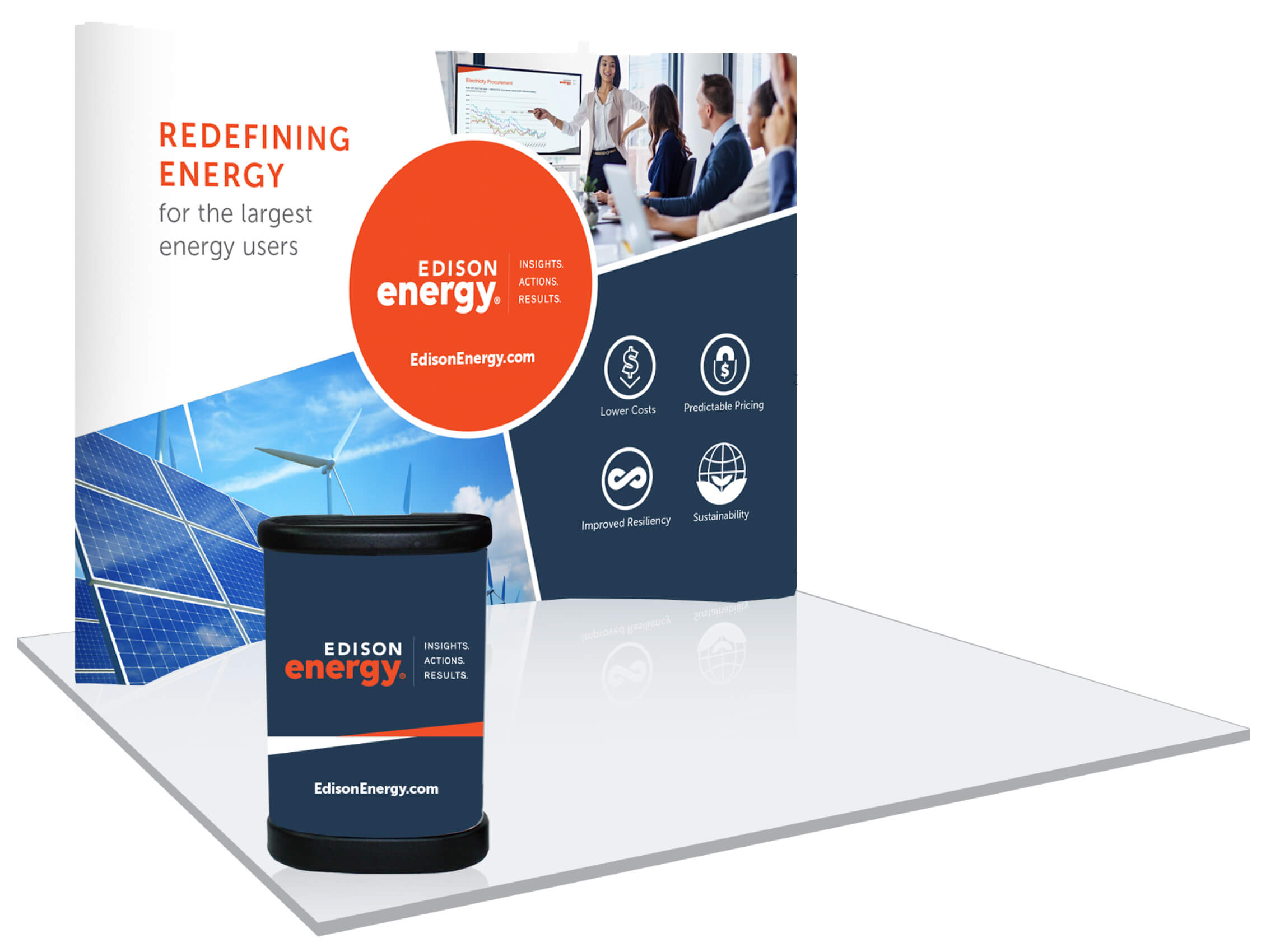
The quadrant and circle graphic is inspired by an old marine pilot map, showing four directions and a compass, evoking Edison Energy’s strategic role with clients.
These elements are used throughout all Edison Energy marketing materials, providing a cohesive, modern, energetic look — backed by a strong brand concept.


